- Published on
Accordion Menu with Tailwind CSS + Alpine.js
- Authors

Accordion Menu
Accordion menu is a type of user interface widget that allows users to expand and collapse different sections of content. In this particular example, there are three sections, each with its own button and corresponding content.

Getting Started
HTML Code
Let's break down the code and explain how it works.
<div x-data="{ selected: null }" class="border border-gray-200 rounded-lg" class="p-3">
<!-- The accordion items -->
<div class="[&>*]:border-b [&>*]:border-b-gray-200 last:[&>*]:border-b-0">
<!-- Accordion item 1 -->
<div>
<!-- The button that toggles the accordion item -->
<button @click="selected !== 1 ? selected = 1 : selected = null"
class="w-full flex justify-between items-center p-3 ">
<!-- The title of the accordion item -->
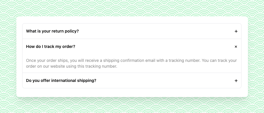
<h3 class="text-sm font-semibold">What is your return policy?</h3>
<!-- The icon that indicates whether the accordion item is expanded or collapsed -->
<div>
<span class="text-lg transition-all block"
:class="selected === 1 ? 'rotate-45' : ''">+</span>
</div>
</button>
<div x-cloak x-show="selected === 1" class="text-sm text-black/50 p-3"
x-transition:enter="transition ease-out duration-100"
x-transition:enter-start="transform opacity-0 scale-95">
We accept returns within 30 days of purchase with the original receipt or packing slip.
Items
must
be in new, unused condition with all original tags and packaging.
<ul class="px-2 pt-3">
<li>List Item #1</li>
<li>List Item #2</li>
<li>List Item #3</li>
</ul>
</div>
</div>
<!-- Accordion item 2 -->
<div>
<button @click="selected !== 2 ? selected = 2 : selected = null"
class="w-full flex justify-between items-center p-3 ">
<h3 class="text-sm font-semibold">How do I track my order?</h3>
<div>
<span class="text-lg transition-all block"
:class="selected === 2 ? 'rotate-45' : ''">+</span>
</div>
</button>
<div x-cloak x-show="selected === 2" class="text-sm text-black/50 p-3"
x-transition:enter="transition ease-out duration-100"
x-transition:enter-start="transform opacity-0 scale-95">
Once your order ships, you will receive a shipping confirmation email with a tracking
number.
You can track your order on our website using this tracking number.
</div>
</div>
<!-- Accordion item 3 -->
<div>
<button @click="selected !== 3 ? selected = 3 : selected = null"
class="w-full flex justify-between items-center p-3 ">
<h3 class="text-sm font-semibold">Do you offer international shipping?</h3>
<div>
<span class="text-lg transition-all block"
:class="selected === 3 ? 'rotate-45' : ''">+</span>
</div>
</button>
<div x-cloak x-show="selected === 3" class="text-sm text-black/50 p-3"
x-transition:enter="transition ease-out duration-100"
x-transition:enter-start="transform opacity-0 scale-95">
Yes, we offer international shipping to select countries. Please see our shipping policy for
</div>
</div>
</div>
</div>
Explanation
In the next section, the class attribute set to "[&>*]:border-b [&>*]:border-b-gray-200 last:[&>*]:border-b-0". This class applies a border at the bottom of each child element except for the last one.
<div class="[&>*]:border-b [&>*]:border-b-gray-200 last:[&>*]:border-b-0">
The <button> element has an @click event listener that toggles the state of the selected variable. This variable is defined using Alpine.js's x-data directive, which creates a reactive object that can be updated by the view.
<button @click="selected !== 1 ? selected = 1 : selected = null"></button>
Rotate icon with 'rotate-45' when accordion selected:
<span class="text-lg transition-all block" :class="selected === 1 ? 'rotate-45' : ''">+</span>
Set [x-cloak] as display: none !important;
[x-cloak] {
    display: none !important;
}
You can access the full code:


- Name
- Umur Köse