- Published on
Custom select menu & dropdown with Tailwind CSS / Alpine.js
- Authors


Introduction
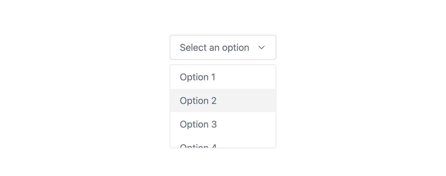
A custom select menu with Tailwind CSS and Alpine.js is easy to use and customize. Tailwind styles the menu, and Alpine.js handles the clicks. Select an option and the menu shows selected item. Text and arrow colors change when you select. Each option has a value. It's simple to set up and change as needed.

Code
<div
  x-data="{ open: false, selected: '' }"
  @click.away="open = false"
  class="relative"
>
  <!-- Button -->
  <button
    @click="open = !open"
    class="min-w-[180px] max-w-[180px] px-4 py-2 border border-gray-300 rounded flex items-center justify-between"
    :class="{'text-black': selected !== '', 'text-gray-500': selected === ''}"
  >
    <span
      class="max-w-[120px] overflow-hidden"
      x-text="selected === '' ? 'Select an option' : selected"
    ></span>
    <svg
      class="ml-2 w-4 h-4"
      xmlns="http://www.w3.org/2000/svg"
      fill="none"
      viewBox="0 0 24 24"
      stroke="currentColor"
    >
      <path
        stroke-linecap="round"
        stroke-linejoin="round"
        stroke-width="2"
        d="M19 9l-7 7-7-7"
      />
    </svg>
  </button>

  <!-- Dropdown Menu -->
  <div
    x-show="open"
    class="absolute mt-2 bg-white border rounded w-full z-10"
    x-cloak
  >
    <ul
      class="max-h-[140px] overflow-auto [&>li]:text-gray-500 [&>li]:px-4 [&>li]:py-2 hover:[&>li]:bg-gray-100 [&>li]:cursor-pointer"
    >
      <li @click="selected = 'Option 1'; open = false;" value="1">Option 1</li>
      <li @click="selected = 'Option 2'; open = false;" value="2">Option 2</li>
      <li @click="selected = 'Option 3'; open = false;" value="3">Option 3</li>
      <li @click="selected = 'Option 4'; open = false;" value="4">Option 4</li>
      <li @click="selected = 'Option 5'; open = false;" value="5">Option 5</li>
    </ul>
  </div>
</div>
Write this on your CSS file:
[x-cloak] {
  display: none !important;
}
Explanation
x-data="{ open: false, selected: '' }"
This is for setting up. It keeps track if the dropdown is showing (open) and which option is picked (selected).
@click="selected = 'Option 1'; open = false;"
This is an instruction. When you click an option, it saves that option and hides the dropdown.
x-text="selected === '' ? 'Select an option' : selected"
This changes the button text. If no option is picked, it asks you to choose. If an option is picked, it shows that option.
:class="{'text-black': selected !== '', 'text-gray-500': selected === ''}"
This adjusts the text color. If no option is chosen, the text is gray. If an option is chosen, the text turns black.
x-show="open"
This decides if the dropdown options are shown or not based on whether open is true or false.
You can access the full code: Select menu / dropdown - Tailwind CSS / Alpine.js


- Name
- Umur Köse