- Published on
Responsive modal with Tailwind CSS / Alpine.js
- Authors


Introduction
A responsive modal is a pop-up box that appears on screen, built using Tailwind CSS for its design and Alpine.js for making it work. Tailwind CSS uses simple classes to make the modal look good on any size screen. Alpine.js lets the modal open and close when needed, like when someone clicks a button to show the modal or presses the Escape key to close it. This makes the modal easy to use. It's also easy to make because there's no need for lots of coding.

Code
<div x-data="{ open: false }">
<button
@click="open = true"
class="px-4 py-2 bg-blue-500 text-white rounded hover:bg-blue-700 focus:outline-none focus:bg-blue-700">
Open Modal
</button>
<div
@keydown.escape.window="open = false"
class="fixed inset-0 bg-gray-500 bg-opacity-75 transition-opacity"
x-show="open"
style="display: none"
x-cloak
>
<!-- Modal -->
<div class="flex items-center justify-center min-h-screen">
<div
class="bg-white p-6 rounded-lg overflow-hidden shadow-xl transform transition-all sm:max-w-lg sm:w-full"
@click.away="open = false"
x-transition:enter="ease-out duration-100"
x-transition:enter-start="opacity-0"
x-transition:enter-end="opacity-100 scale-100"
x-transition:leave="ease-in duration-200"
x-transition:leave-start="opacity-100 scale-100"
x-transition:leave-end="opacity-0"
>
<!-- Modal header -->
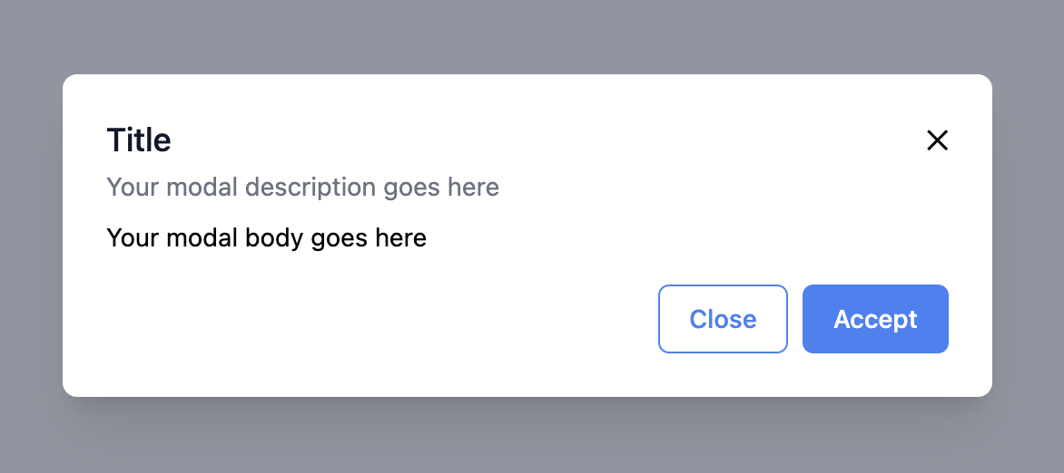
<div class="flex items-start justify-between">
<div class="text-left">
<h3 class="text-lg leading-6 font-medium text-gray-900">Title</h3>
<div class="mt-1">
<p class="text-sm text-gray-500">
Your modal description goes here
</p>
</div>
</div>
<span class="cursor-pointer" @click="open = false">✕</span>
</div>
<!-- Modal body -->
<div class="text-left my-2">
<p class="text-sm text-black">Your modal body goes here</p>
</div>
<!-- Modal footer -->
<div class="flex items-center justify-end gap-2 mt-4">
<button
type="button"
class="w-full inline-flex justify-center rounded-md border border-blue-500 px-4 py-2 text-base font-medium text-blue-500 hover:text-white hover:border-blue-400 hover:bg-blue-400 focus:outline-none focus:ring-2 focus:ring-offset-2 focus:ring-blue-500 sm:w-auto sm:text-sm"
@click="open = false"
>
Close
</button>
<button
type="button"
class="w-full inline-flex justify-center rounded-md border border-transparent px-4 py-2 bg-blue-500 text-base font-medium text-white hover:bg-blue-400 focus:outline-none focus:ring-2 focus:ring-offset-2 focus:ring-blue-500 sm:w-auto sm:text-sm"
@click="open = false"
>
Accept
</button>
</div>
</div>
</div>
</div>
</div>
Write this on your CSS file:
[x-cloak] {
  display: none !important;
}
Explanation
x-data="{ open: false }"
This is an Alpine.js directive that initializes a new component with some data. Here, it's creating a data object with a single property open, which is a boolean set to false. This property is controlling whether the modal is open or closed. When open is true, the modal will be displayed; when open is false, the modal will be hidden.
@click.away="open = false":
This directive tells Alpine.js to listen for click events that happen outside of the current element (in this case, the modal). If a click occurs outside the modal, the expression open = false is executed, which will set the open property to false and cause the modal to close. It's a convenient way to close modals or dropdowns when the user clicks away from them.
@keydown.escape.window="open = false":
This directive is listening for a keydown event specifically for the Escape key (ESC). The .window modifier tells Alpine.js to listen for this event on the window object, which means it will work no matter where the focus is on the page. When the user presses the Escape key, the open property is set to false, which will hide the modal.
Transitions
x-transition:enter="ease-out duration-100"
This specifies the transition to use when the modal enters (becomes visible). The ease-out means that the transition starts fast and then slows down towards the end. The duration-100 sets the duration of the transition to 100 milliseconds.
x-transition:enter-start="opacity-0"
This defines the starting state of the entering transition. opacity-0 means that the modal starts fully transparent (invisible).
x-transition:enter-end="opacity-100 scale-100"
This defines the end state of the entering transition. opacity-100 means the modal finishes fully opaque (visible). scale-100 indicates that the modal should be at its full size; in transitions, you can animate the scale to make the element grow or shrink — scale-100 means no scaling is applied, so it stays at its natural size.
x-transition:leave="ease-in duration-200"
This specifies the transition to use when the modal leaves (becomes invisible). The ease-in means that the transition starts slowly and then accelerates. The duration-200 sets the duration of the transition to 200 milliseconds, which is slightly longer than the enter transition, giving a different feel as it closes.
x-transition:leave-start="opacity-100 scale-100"
This defines the starting state of the leaving transition. The modal starts fully visible and at full size.
x-transition:leave-end="opacity-0"
This defines the end state of the leaving transition. The modal becomes fully transparent, effectively disappearing from view.
You can access the full code: Responsive modal - Tailwind CSS / Alpine.js


- Name
- Umur Köse